The lay reader may not focus on the details or have a comprehensive historical model in mind, but a skilled typographer can design a page that will evoke a particular time and place, at least subliminally, for any reader who takes in the page as a visual object in addition to seeing it as a repository for a stream of words.
Recreating obsolete typesetting styles is not something that’s called for every day, and I don’t do it every day. But I’d like to show you three projects that illustrate what I’m talking about.
19th c. America
Janice Campbell, at Everyday Education, wanted to publish a facsimile edition of McGuffy’s Readers. Mostly this consisted of cleaning up scans of the original pages, but the publisher wanted to include a modern introduction contextualizing the relevance of this series in the modern school environment.My challenge was to integrate the new frontmatter, including a title page, copyright page, table of contents, and the lengthy new introduction in a way that complemented the original pages, so that there would not be an abrupt and jarring transition. It was sufficient to choose a font that was similar enough to the original to give the page a similar color and feel overall but that still met modern standards for readability and legibility. The introduction was long, and I wasn’t trying to make reading it a painful experience.
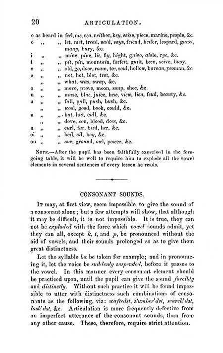 |
| A scan of an original McGuffy's Reader page |
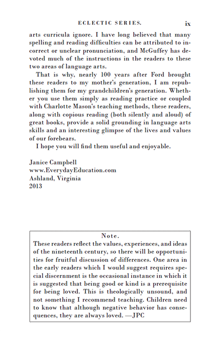 | |
| A page from the modern frontmatter |
17th c. England
The progenitor of the Horton family in America was one Barnabas Horton, born in England in 1600. Jackie Dinan spent years delving into primary sources from the period to produce an award-winning biography of her husband's ancestor, in which she quoted extensively from 17th c. documents.My first challenge was to ensure that I chose a typeface that existed and was used in England during the man's lifetime. When we think of the Colonial period in North America, we think of Caslon. After all, it was William Caslon's types that Benjamin Franklin used, right? But Caslon wasn't born until after Barnabas Horton died. So that choice would have been anachronistic. I ended up choosing a digital version of Jenson that closely follows the Jenson types English printers imported from the Continent in the 17th c.
Then I wanted to evoke the kind of page layout and typesetting current during the era (using ligatures like ct and st, for example) but without intruding excessively on the reader's consciousness (as would be the case if I had also used the long s). I ended up with something a little bit affected, I'll admit, but I think it worked.
 |
| A page from Leviathan, published in 1651 |
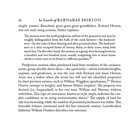 |
| A partial page from In Search of Barnabas Horton (Pynsleade Books, 2015) |
Mid 20th c. England
Sarah Dronfield approached me about a project to reissue an out-of-print novel published in England in 1940. She sent me a scan.
 |
| Scan from Across the Black Waters |
The normal way to reissue an old novel is just to apply a contemporary template. In this case, there was a request to match the format of the original, so I matched the margins and the style of the chapter opening.
 |
| A standard template applied |
Could I match the typeface? As a matter of fact, I could. I knew that the original was typeset using a Lanston Monotype machine, and I was able to track down an excellent match of the original font.
 |
| The font matched |
But this was still set using modern techniques the Monotype was not capable of. Could I match the spacing, particularly between sentences, and match the original line for line? Yes I could.
 |
| A dead-on match |
I proceeded to do a test for several pages, during the course of which I realized that the original book had been typeset by an inexperienced operator. England was in the war by then; perhaps the printer had to make do. Or perhaps the publisher put the job out to the low bidder, as publishers sometimes do. For whatever reason, this was shoddy work, far beneath what the equipment was capable of in the hands of a skilled operator.
So I concluded that matching the original line for line, which would have been an expensive proposition, was not giving us what we wanted, which was to match the look and feel of the original but do it the way it should have been done in the first place.
 |
| The finished test |
And that's what I'll do, as soon as the publisher's fundraising campaign succeeds.
Your eyes may not be attuned to the slight differences in the last few images, and that's fine. As I said, the point is to evoke a time and place subliminally, not overtly.
2 comments:
Well said, Dick! This is a big reason why typesetting is such an interesting pursuit.
Such a fascinating project, and wonderful results - thank you for sharing it with us!
Post a Comment