Tuesday, August 22, 2017

Making a point. Or three points. Or an ellipsis.

Someone asked a question today on Facebook, in an editing group, about a particular use of ellipsis points. The question had to do with whether there should be space before or after the ellipsis in that situation. The details of the question don't matter, but the question exposed a common fallacy.
People (and by people, I mean specifically authors and copyeditors) often confuse punctuation conventions with composition conventions. I want to take a moment to go back to first principles.

Punctuation is part of our writing system. While the marks and their uses have evolved over time, they predate printing, and their modern forms predate the typewriter, which was introduced in the latter part of the 19th c. There are only a few marks of punctuation, and you can write them all with a pen easily enough. So, purely from the writer's point of view, you can space your three dots any way you please.

The traditional compositor, standing at his type cases, had access to hundreds of different types to represent many alphabets (even in the 15th c., texts of mixed Latin, Greek, Arabic, and Hebrew were not uncommon) and all the various accented letters, ornaments, and so on, that might be called for by a book. Among these were variants on specific characters for use in different circumstances. Examples include small caps, dashes of different lengths (the handwritten dash is whatever length you write it; it's still a dash), a special-purpose types that might never occur in the manuscript but that were needed for a typeset book.

Among the latter were dot leaders, the rows of dots typically used in a table of contents or in various other sorts of tables. These were styled in a few different ways. They might be spaced one em apart (an em is a square of type of the point size being used). Those were called one-em dot leaders. They might be spaced two to the em (two-em dot leaders). And they might be spaced three to the em (three-em dot leaders).

When digital fonts and desktop publishing were being developed, computer programmers went to compositors to learn about typesetting. Somewhere, in some conversation, someone confused the three-em dot leader (…) with ellipsis points (. . .), which traditionally were spaced dots. That error became embodied in the Unicode standard, and the name of … is officially the horizontal ellipsis. However, traditional typesetters don't see it that way, and most professional compositors, to this day, will replace it with evenly spaced points that are also spaced, by the same amount, from surrounding text.

They will do this, if they are conscientious and detail-oriented, regardless of how the author and copyeditor have formatted the ellipses in the manuscript. The author is responsible for indicating the desired punctuation (an ellipsis), not for knowing composition conventions. The copyeditor, who probably ought to know something about composition but in many cases doesn't, should not get tied up in knots about whether there is a space before the …, after it, or both but should let the compositor take care of that detail.

I hasten to add that many books are produced by graphic designers who know less about composition best practices than most copyeditors. So practices have to be adjusted to circumstances. But in the ideal world, publishers would hire skilled compositors to set the type instead of relying on graphic designers.
Thursday, July 06, 2017

Evoking an era in type

As typesetting technology has evolved over the centuries, the practices of compositors have evolved as well, both in response to advances in technology and in response to economic forces. Any perceptive student of type, whether a designer or an antiquarian book collector or a reenactor in a period print shop, can look at a printed page and have a pretty good idea of what century it was printed in and perhaps what country, too.

The lay reader may not focus on the details or have a comprehensive historical model in mind, but a skilled typographer can design a page that will evoke a particular time and place, at least subliminally, for any reader who takes in the page as a visual object in addition to seeing it as a repository for a stream of words.

Recreating obsolete typesetting styles is not something that’s called for every day, and I don’t do it every day. But I’d like to show you three projects that illustrate what I’m talking about.

19th c. America

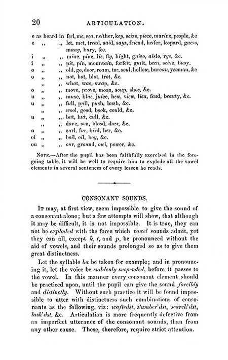
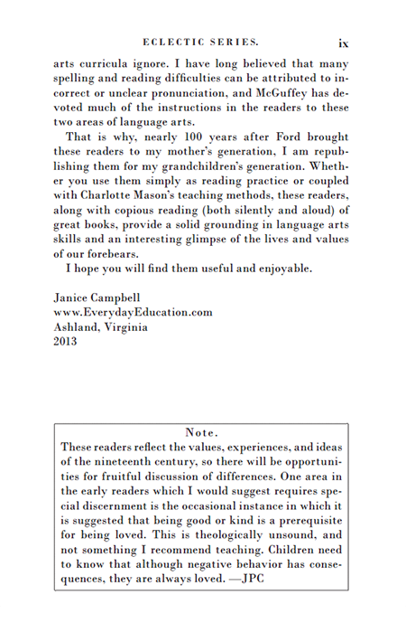
Janice Campbell, at Everyday Education, wanted to publish a facsimile edition of McGuffy’s Readers. Mostly this consisted of cleaning up scans of the original pages, but the publisher wanted to include a modern introduction contextualizing the relevance of this series in the modern school environment.

My challenge was to integrate the new frontmatter, including a title page, copyright page, table of contents, and the lengthy new introduction in a way that complemented the original pages, so that there would not be an abrupt and jarring transition. It was sufficient to choose a font that was similar enough to the original to give the page a similar color and feel overall but that still met modern standards for readability and legibility. The introduction was long, and I wasn’t trying to make reading it a painful experience.

A scan of an original McGuffy's Reader page

 
A page from the modern frontmatter

17th c. England

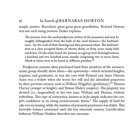
The progenitor of the Horton family in America was one Barnabas Horton, born in England in 1600. Jackie Dinan spent years delving into primary sources from the period to produce an award-winning biography of her husband's ancestor, in which she quoted extensively from 17th c. documents.

My first challenge was to ensure that I chose a typeface that existed and was used in England during the man's lifetime. When we think of the Colonial period in North America, we think of Caslon. After all, it was William Caslon's types that Benjamin Franklin used, right? But Caslon wasn't born until after Barnabas Horton died. So that choice would have been anachronistic. I ended up choosing a digital version of Jenson that closely follows the Jenson types English printers imported from the Continent in the 17th c.

Then I wanted to evoke the kind of page layout and typesetting current during the era (using ligatures like ct and st, for example) but without intruding excessively on the reader's consciousness (as would be the case if I had also used the long s). I ended up with something a little bit affected, I'll admit, but I think it worked.

A page from Leviathan, published in 1651


A partial page from In Search of Barnabas Horton (Pynsleade Books, 2015)

Mid 20th c. England

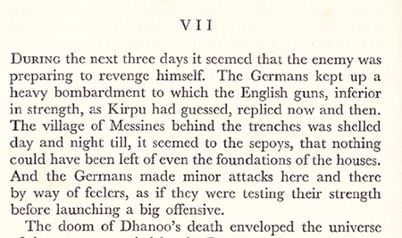
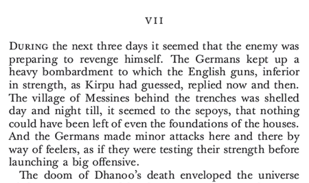
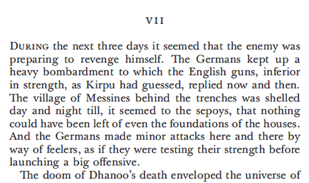
  Sarah Dronfield approached me about a project to reissue an out-of-print novel published in England in 1940. She sent me a scan.

Scan from Across the Black Waters

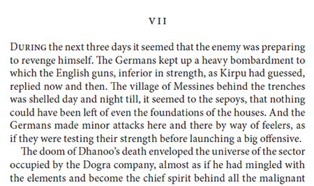
The normal way to reissue an old novel is just to apply a contemporary template. In this case, there was a request to match the format of the original, so I matched the margins and the style of the chapter opening.

A standard template applied

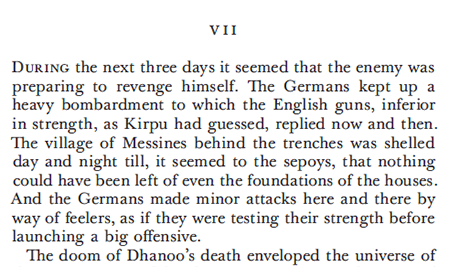
Could I match the typeface? As a matter of fact, I could. I knew that the original was typeset using a Lanston Monotype machine, and I was able to track down an excellent match of the original font.


The font matched

But this was still set using modern techniques the Monotype was not capable of. Could I match the spacing, particularly between sentences, and match the original line for line? Yes I could.

A dead-on match

I proceeded to do a test for several pages, during the course of which I realized that the original book had been typeset by an inexperienced operator. England was in the war by then; perhaps the printer had to make do. Or perhaps the publisher put the job out to the low bidder, as publishers sometimes do. For whatever reason, this was shoddy work, far beneath what the equipment was capable of in the hands of a skilled operator.
So I concluded that matching the original line for line, which would have been an expensive proposition, was not giving us what we wanted, which was to match the look and feel of the original but do it the way it should have been done in the first place.

The finished test

And that's what I'll do, as soon as the publisher's fundraising campaign succeeds.
Your eyes may not be attuned to the slight differences in the last few images, and that's fine. As I said, the point is to evoke a time and place subliminally, not overtly.


Tuesday, April 04, 2017

A framework for thinking about book typography

While typography evolved from classical and medieval roots, the modern body of knowledge that forms the basis for best practices in commercial (keyword that I'll get to in a minute) book typography really developed in the last few years of the 19th c. and the first few decades of the 20th. Until the 1960s, graphic arts programs taught a set of mechanical arts to bright kids who were not headed to college. Today, these same kids become IT techs and staff the genius bar at the Apple store. The requirements were the ability to learn a bunch of arcane facts, manual dexterity, and some amount of visual sense. You didn't have to be a creative genius. 

Graphic arts programs taught core skills—copyediting, markup (specifying type), typesetting, page makeup, imposition (later lithographic stripping), platemaking, press work, and bindery operations.

Beginning in the 1960s, roughly, a parallel movement started training more artistically inclined students in graphic design. Mostly, graphic designers were involved in advertising, magazine layout, movie posters, and so forth—media where a sizzling layout was more critical than readability of the text. With the advent of desktop publishing, the demand for people trained in graphic arts dried up. Today, there are lots of graphic design programs, but good luck finding an old-style graphic arts program.

So what do I mean by commercial book typography? I mean producing readable text that follows a bunch of rules that were pretty standard across publishing houses (balanced spreads, no widows, ladders, rivers . . . ). And if you did all that, the book was good enough to sell commercially. It might not get you into the AIGA Fifty Books of the Year selection, but you could hold your head up.

So when we talk about learning book typography, we're really talking about that old graphic arts curriculum, at least the parts of it that still apply, and those same commercial standards. It's a learnable discipline for anyone who meets those same basic requirements. It's not magic, but it does take practice and either hands-on training or a lot of reading.

Now I'll grant you that a lot of publishers today have stopped applying those standards and have begun to accept pushbutton typesetting, with no human intervention, as a way to cut costs. That's a reality in today's world. But it's not what I think of when someone asks about book typography.

Friday, February 24, 2017

Jargon as shibboleth

Yesterday, a colleague, a man who was trained in the law in his native England and has lived in Israel for many years, no dummy he, asked in an editing forum about the meaning of something he read in the Wall Street Journal: “ABB Ltd. said it would likely book a $100 million charge related to a ‘sophisticated criminal scheme’ it said was orchestrated by the treasurer of its South Korea unit, who has gone missing.”
“Just wondering what ‘book . . . a . . . charge’ means.”

I replied that it was bizspeak for “show a charge against earnings on the company's books.” He then said that having once been in charge of the books of a public company, he would have just said they had “written off” the amount.

This led me to think about the way business reporters write (not all of them, certainly, but a significant percentage). I think the business press is not unlike the sports press in its constant creation of new shibboleths to separate those in the know from the unwashed masses. If you don't keep up with the latest slang, the latest bizspeak, you're obviously not part of the in crowd, the people in the know, the winners. You're a loser. You're not welcome here.

I can see how this attitude might evolve in a company that promotes based on social cues rather than actual job performance. But I'm an editor, not a corporate ladder climber or a business journalist. So my interest is in clear communication between author and reader. Unless the author is hellbent on selling as few books as possible to a narrow audience, I'm always going to recommend reducing the use of jargon and writing clearly and to the point. The book will be better for it.