- Readability. The typographer’s first obligation is to the reader. Readability is both biologically bound and culturally bound. That is, there are physiological and psychological components to reading that we share across cultures; and there are cultural norms that affect our expectations. The typographer tries to stay within those cultural norms so the reader is not distracted by something that looks odd, even if that something would be completely unremarkable in another country. A simple example: British spelling and punctuation look odd to US readers and vice versa. The physiological and psychological aspects of typography have to do with line length, line spacing, point size, and some of the more arcane details of composition.
- Connotation. As readers since early childhood, we have grown up immersed in conventions we do not think about. We are not supposed to think about them in the left-brained, verbal, analytical sense. However, we have absorbed them, in a right-brained, intuitive, experiential sense. Let me try something obvious here:
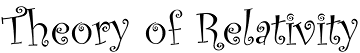
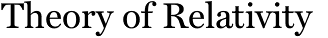
 Which of those three fonts would you be most likely to see used for headings in a physics textbook?
Connotation extends to the look and feel of the page, as well. How ample are the margins? How traditional is the layout vs. how modern-looking? When you look at the page, are you transported to a cathedral or to a schoolbus or to a tent in the woods? Book design encompasses more than just typography. The designer has to consider the nature of the paper surface and the way the book will be printed, as well; and both of these factors affect choices the typographer makes.
Which of those three fonts would you be most likely to see used for headings in a physics textbook?
Connotation extends to the look and feel of the page, as well. How ample are the margins? How traditional is the layout vs. how modern-looking? When you look at the page, are you transported to a cathedral or to a schoolbus or to a tent in the woods? Book design encompasses more than just typography. The designer has to consider the nature of the paper surface and the way the book will be printed, as well; and both of these factors affect choices the typographer makes. - Cost. A book is a product. That is, you are going to pay for it to be manufactured and then you are going to sell it to a reader, and you hope to make a buck in the process. Therefore, you have to consider the cost of manufacturing as it relates to the price you want to sell the book for. The typographer has to take cost into consideration when designing the book, just as any other product designer—or architect—has to consider cost. In terms of book design, cost shows up in the form of page size and page count, factors that interact with readability and connotation at the boundaries of margin size, font choice, font size, and line spacing.
- Aesthetics. The typographer’s job is to create an appealing, inviting page that helps the reader stay focused on the content that the author is trying to convey. At the same time, if the page is so luxurious that it distracts the reader from the content, then the typography is not serving its primary purpose. (The exception is in the field of business documents, such as annual reports, where the purpose of the design often is to distract the reader from the content.)
Tuesday, June 06, 2006
The architect of the page
Editor’s note: If you are just joining us, this post is part of an intermittent series (starts here, most recent installment here), addressed primarily to the self-publishing author, in which I use an old conceit [3a], that of a wooden barrel as a metaphor for a process dependent on many inputs, to describe book publishing, with the volume of water in the barrel representing sales. The notion is that the level of the water is limited by the shortest stave.
“Form follows function.” This principle drives much design and did so long before it was articulated so succinctly. We associate the quote primarily with architecture, but it applies equally to industrial design and to graphic arts, particularly to typography.
The typographer is the architect of the page and should try to design the page to serve its function—or rather its functions. What are those functions?
Subscribe to:
Post Comments (Atom)
No comments:
Post a Comment